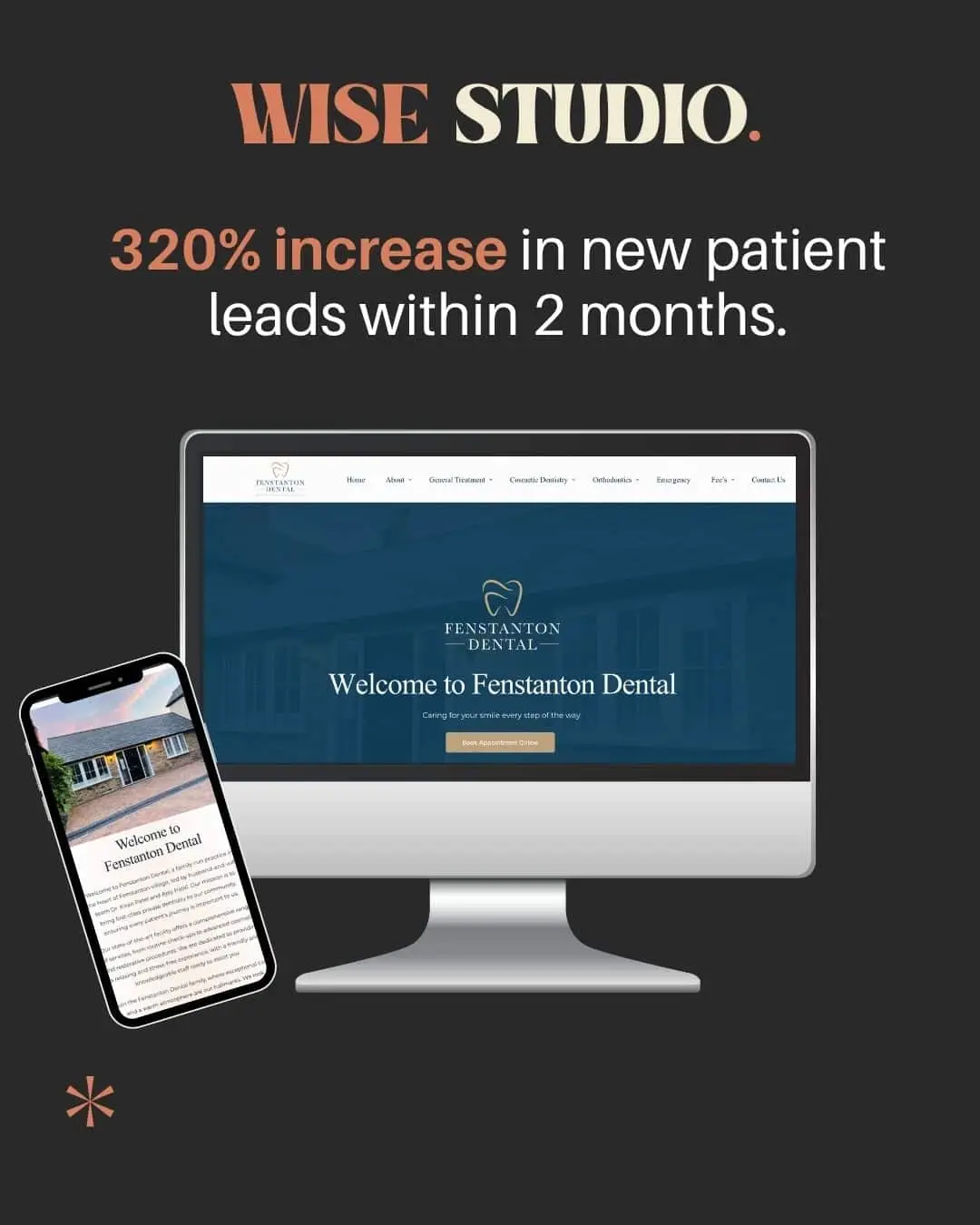
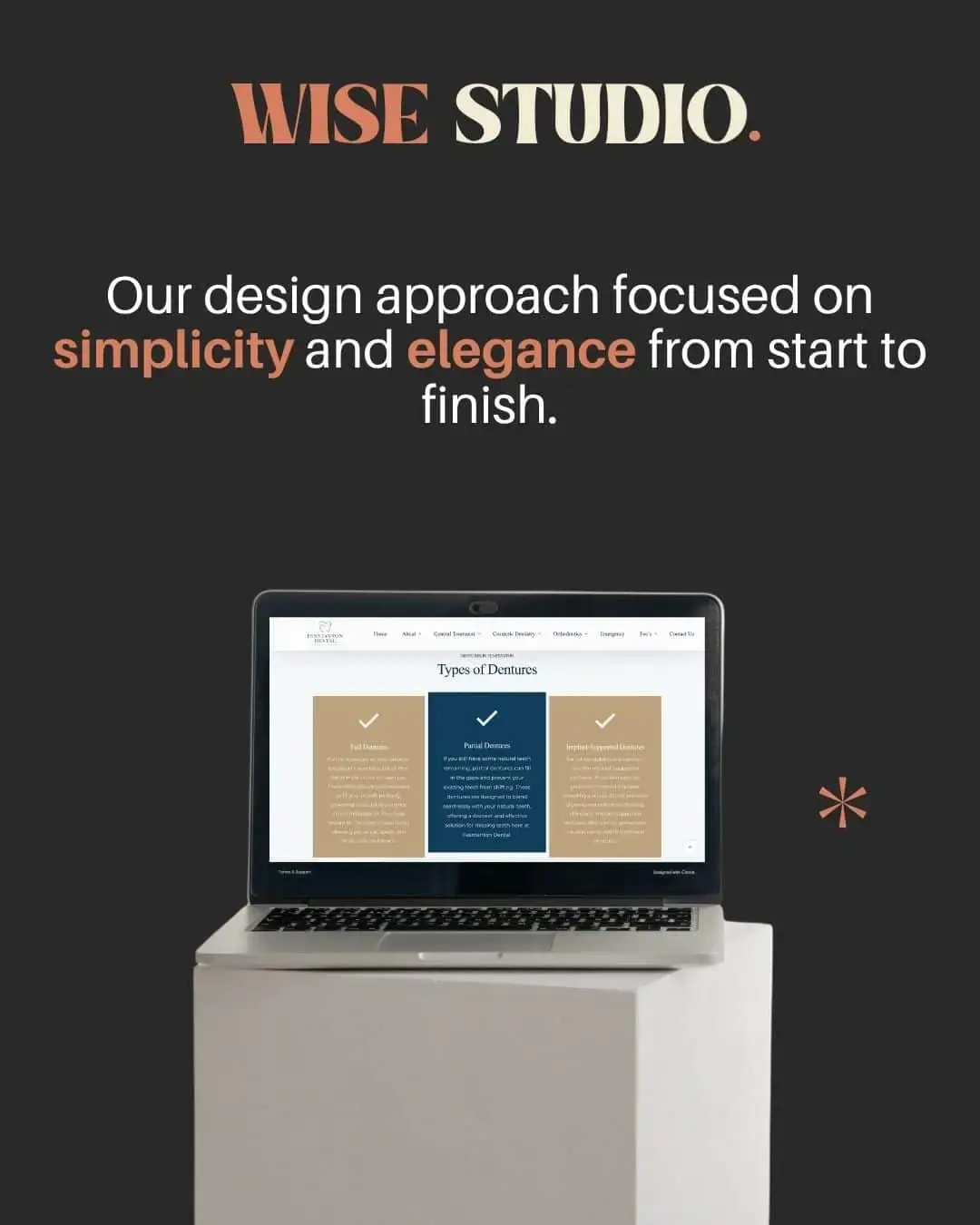
1. We removed anything that didn’t serve the user.
Every page, section and line of copy was designed to feel easy, calm and intuitive.
2. We built a visual system using warm neutrals, deep blues and gold accents – so the site looked premium without trying too hard.
3. Buttons, forms and CTAs were positioned exactly where patients expect them. No hunting. No scrolling endlessly.
Just smooth movement across the whole site.